Thursday, 20 October 2011

Research into similar products -'What's on TV' Cover

The layout of this cover is unconventional and dose not fit in with the other front covers, this can be seen because of the use of bubbles and the positioning of the main story. Having it on the left and not centralised. The rote of the eye follows conventions, with the title of the cover in the primal optical area. Having this as the first thing that the audience sees allowing them to know what the cover is. However the way in which the title is laid out is unconventional, using the boxes to put it in instead of having the headline across the front. Though having it only use up a one area allows the cover to use more teasers. This can be seen as the eye goes through the centre of the cover, this covers two stories. The main soap story and then going through the ‘Doctor Who’ teaser; going through these two teasers would appeal to a wide audience, being that both of these programmes have big audience but with this the both appeal to different audience. So having both of them in the rote of the eye makes the cover appeal to a wide audience. Then in the terminal area they show a teaser for ‘Corrie’ using this in the terminal area means that the audience will remember that trailer. This can be seen with the principle of thirds in the way the hot shorts are placed having them covering the title, main story and other teasers. Having the poster laid out like this makes sure that the audience sees all the stories. The cover is more disorder than the other covers I have looked at in the way in which the main stories and teasers are placed. Though with this it is clear to the audience what is being shown. The way in which the front cover is laid out is important, in getting the magazine distributed and bring in an audience for it. When creating my cover I need to think carefully about were I place the images and the stories because of the effect that it has on the audience.

Using the impact font makes the titles standout from the images and gets the audience attention. Where as the other covers I have looked at has had a house style on the fonts used, this one different styles of each teaser, doing this makes each teaser standout to the audience.
This can be seen with the main teaser in which they use two different styles; using ‘KICKED OUT!’ in capitals allows it to get the audiences attentions being that this is the main element of the cover and all the other teaser use smaller font, which allows phases to standout. The other writing used on that teaser is of a different colour and smaller writing. Having the two different styles on the teasers makes both of them to standout. Using this technique is effect and I feel will have good effect when creating my cover. The teasers around the outside each have their own style than fits in with the impact font, using this font is conventional to the font cover. Using this font makes the writing draw the audience in from the stand. This is something that is important when distributing the magazine.   

Using blue as the background appeals to a male audience and then having titles in more famine colour makes the cover appeal a female audience. Using these colours has a similar effect to that of ‘Inside Soap’ making the cover neutral and appeal to both genders, this is important in make the cover appeal to a wide audience. This is something that I need to think carefully about and the effect it has on which audience it appeals to.  
The headline box has a back colour of red with white writing. Having the red background makes it standout from the background, this is conventional and most of the magazine cover has a red title or background. Makes the writing white, allows it to standout from the red colour and gets the audience attentions. The colours used stands out because; using two colours gets the audience attentions to set words. This can be seen with the ‘Corrie’ teaser, having the names in blue
and then use the colour pink for ‘TWINS!’ makes it get the audience attentions and shows the way in which it is the important phase. Where as the ‘Doctor Who’ teaser uses a red with a white background, having this colour scheme is the opposite to the headline colours but has the same effect. With this teaser the writing starts off small and gets larger with the word ‘FINALE!’ having this big makes it standout, allows the audience to remember it. The teaser next to it, for the girl uses purple writing, this fits in with the representation of the girl and where the colour of ‘Doctor Who’ appeal to a more male audience using the purple appeal to a female audience. This can be seen throughout the cover, with the colours used appealing to both male and female audience. This is something that I feel is effect and would appeal to my target audience when creating my cover.   

The images used fit in with the convention, having the close and mid shots allows the audience to have an understanding of who the characters are. The main story shown use a close up shot of Kat and Alfie, using this allows the audience to see there facial expression and this gives them an idea of the type of characters they are. The way in which the characters are placed signifiers that they have a close relationship. Having the images of ‘Eastenders’ is typical and each cover I have looked at has had ‘Eastenders’ as the main image, this is because ‘Eastenders’ has a large audience. Showing the way in which this soap has a effect the audience buying the magazine, this means when it comes to choosing what images and soap to show it is important to look at the audience they get.  


Along with this they use images taken from the programme; this can be seen with the image use for ‘Corrie’ in which the two characters are placed in a hospitable, using this location fit in with the title, allowing the audience to clearly see what is happening. Also using this image the audience can see the characters relations to what is happening, doing this means that the audience can clearly understand what is going to happen with that storyline. Where as the image used for ‘Doctor Who’ has just the two characters looking out at the audience.  The mid shot used for these characters allows the audience to see their costume; this can be seen with Rive Song in which she is wearing a red dress. This connotes to the audience the way in which she is dangerous and having her behind the Doctor signifiers the relationship they have, the role in which she will play in the programme. The way in which the images are used is conventional and gives the audience information’s about the character through their conventional representations.         

The language which is used is informal and fits in with the conventions. Using this informal language appeal to the audience and from my research I have found that this is something used throughout soap magazine covers. When creating my cover I believe that using this style of writing will appeal to my audience and allow them to have a clear understanding of what is being said. This is something that I think this cover dose well, using the short snappy phase allows the audience to be able to read the cover lines from far. For each of the teaser there is only a small title such as with ‘Merlin’ in which the title of the programme and ‘New’ is all that is shown. Using this allows the audience to instantly now what the article is going to be about. This technique is used throughout the cover and I believe that it is more effect than using lots of information. When doing audience research I will find out what technique appeal to my target audience more.

The ways in which the different characters are representation are conventional to the way in which they are shown on their programme and allow the audience to connect with them. This can be seen by uses different types of characters such using the ‘Doctor’ to appeal to a male audience and then having ‘Robbie’ to appeal to a female audience. The representation of the characters is shown through the technique areas this allows the audience to know who the character is and what role they play. This is done in a very conventional by using the mid and close up shots of the characters. However the way in which the different teaser is laid out is unconventional and makes the layout look disorder. When choosing the type of layout I would like to use, I will show my target audience different layouts like this one to see which cover appeal to them most. Working out which conventions will best appeal to my target audience is important, in getting people to buy the magazine.  

Sunday, 16 October 2011

Research into similar products -'Soaplife' Cover

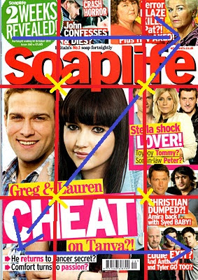
Looking at the rote of the eye it follows the conventional layout. Having the information bubble as the first thing that the audience see, allows the audience to know what the magazine is. This can also be seen by having the teasers along the top allow the audience to see what is going to be in the magazine. When the eye goes through the middle it see the title and the main story characters photo having this in the middle allows the audience to see the main story and this should appeal to them.  Then like the top the bottom use story titles and teasers to appeal to the readers. The way in which the images have been placed through the rote of the eye follows conventions and allows the audience to understand what will be inside the magazine. The principle of thirds also follows the conventions of a front cover, having the hot spots around the main character draws the audience attention to her and can see that she in the main person in the story. This can also be seen as she is in the primal optical area signifiers the way in which she is the most important character. Filling the dead areas with teasers makes the most of the spaces and fits in with the conventions. Using this appeal to the audience, being that different stories will appeal to different people.    
The way font is used is conventional and stands out in a shop, allowing people walking past to be able to clearly read what is being said. Their is a house style that links different teasers having together, doing this highlights the way in which these stories are linked and allows the audience to have a clear understanding of what the teaser is saying. The 'two week' bobble uses thinner font, having this have its own font makes it stand out from the teasers and using this font makes it fit into the space.
Where as the words 'CHEAT' and 'LOVER!' have matching font, using the capital letters and the impact font makes these words stand out from the other tiles. Using this font allows the audience to gain a full understanding of the storyline; also using the short snappy words makes it stay in the audience minds. Then bullet-points at the bottom are unconventional being that they are long phases, thought they use a smaller size font doing this shows the way in which it is less important.  This can be seen with the teasers in with the information show using a smaller font, however using the impact font is typical and makes what is being said standout. Using this style makes the headlines stand out and gets the audience attentions.               
                  
Where as the other cover used neutral colours, where as the colour scheme for this cover uses more female colours using the pink, yellow and white. Having these colours makes the cover standout from other covers however using this scheme could put off male audience members, thought the target audience of soaps is females. The way in which I look a colour and the effect it has on the audience when choosing
my colour scheme. Having the headline in red is conventional to magazines but use this colour makes it standout from the background and gets the audience attention. The teasers along the top use white writing but have a red background, using this has the same effect and makes the teaser stand out, allowing the audience to clearly see what is being shown. Having the bubble green makes it standout being that it is the only thing on the cover in that colour scheme, using this makes it standout from the teaser and gets the audience attention.    


The images used fit in with the conventions of the soap font covers uses the mid shots, this can be seen in the main image in which the audience can see the facial express and what the they are wearing. Having the denim sleeveless jacket signifiers the tom-boy characteristics of the characters, this is matched by the facial express in which it connotes to the audience that she is up to something, which can be seen in the position of the characters, using the male character at the back reflects the way in which the female character plays a bigger part in the storyline.
This can also be seen in the teasers in which the female character is stood at the front with the two males behind her, signifing the way in which she is in control. The costume used reflect the way in which the female character is innocent being that she is wearing white and the male characters behind her are wearing black connoteing the way in which they are the ‘bad’ characters in the storyline.The first teaser of the man in the car is an image used from the soap, this is something that the other soap used and helps the audience to gain an understanding of what is going happen. Using this image also draws attention of the audience to the image and allows the audience to know what is going to happen, this is reflect by the font used having a horror font connoting the dramatic storyline and fits in with what is being said ‘CRASH HORROR’. 
The language used is typical of that found in font cover, using the short and snappy phases that will get the audience attention and stay in their minds. This can be seen with ‘Eddie EXIT?’ using this alliteration makes it standout and putts effect on what is being said. The langue used in the cover is unconventional and appeal to the audience being that it is easy to read and allows the audience to fill like to language is talking to them which appeal to them, when thinking about creating my cover I need to think carefully about the way in which I shape my language to make sure it appeal to the right audience. The language used is unconventional being that it uses long phases, where as most cover use short phases, using the long phases allows the cover to put over all the information it wants to the audience. Through when creating my cover I think that it would be better if I used short phases as it would make it easier of the target audience to read them when walking past. 

The characters are represented in a typical way that highlights the characters in the soap. Showing the conflict that they characters having, the way in which these characters are represented can be seen through the use of positioning with the female characters being in control over the male characters. This is unconventional, as many women are shown to be weaker then men. However the target audience for soaps is female, which means to appeal to them female characters are going to be shown in a powerfully way. This is also seen in the conventions used having the colours scheme, using the pink is a conventional colour to aim at a female audience. However from looking at other magazine cover there are elements that are unconventional, using the long phases and the layout having the dates at the top which is usual placed at the bottom, so that the audience will remember it. When creating my cover I need to think about what conventions I think would appeal to my audience and what conventional I think would be best to not to follow being that they would not appeal to my target audience.      

Friday, 14 October 2011

Research into similar products -'Inside Soap' Cover


The layout of this front cover allows the audience to have an understanding of what is going to be inside. Having the title being the first thing seen allows the audience to know what the magazine is. Having this placed in the primary opiate area allows the audience to clearly know what they are looking at and being the first thing that they see makes the most of the area. Also across the top there is a teaser bar, putting this along the top allows the audience to see what will be in the magazine. Next to this there is a page corner in which the by line ‘First for big soap news!’ will draw the audience in and placing it in the top corner makes the most of the spaces, appealing to audience. This also stands out against the other things shown on the cover. Following the rote of the eye across the middle brings the audience attentions to the main characters and what the main story is going to be. Placing this in the middle makes the characters stand out from the other stories; this is also the conventional place to put the characters. Across the bottom they use teaser of other stories. These two stories are unconventional in their size, most conventional teasers are small were as these two are larger it allows the audience to clearly see the teaser. This is something that could work when creating my magazine cover. The principal of thirds is clearly seen in this poster, with it spilt into three sections. With the title and teaser along the top then the main photo and then teasers along the bottom. Having this layout makes it clear to the audience the main story and frames the photo which makes it stand out from the other stories. The way in which the hot spots are placed at the top and bottom draw the audience attention to the other sections. The way in which the front cover is laid out makes the most of the principal of thirds more than the rote of the eye. Doing this makes the most of the dead areas and allows the audience to have a clear idea of what is going to be in the magazine to make in appeal to them. Through the layout of the photos is organised, where they have placed the titles makes the cover appear to be disorder. This I felt is off putting and feel that if it had been more organised it would appeal to the audience more.

The front used is done in the same style using throughout the cover. Using this house style makes the titles stand out from the photos. However with this the titles used at the bottom teasers used as different technique, this can be seen with the left one.
 In which they use all capitals this makes particular story stand out this can also be seen with the words ‘NEW AGONY!’ and ‘PREGNANT!’. Putting these in capitals makes them stand out to the audience and reflects the way in which these are the important elements of the text. Also using the short snappy words in this way, makes the story stand and to the audience, using this also makes the phrases stay in the mains of the audience. Using this Impact font makes the writing standout to the audience.  The way in which the front used stands out from the photos this can be seen by the use of different sizes. Having the word ‘Heartbreak!’ as big as the title makes it standout this is a typical storyline in a soap and the way in which the title is used also fits in with the conventions of a magazine cover. The way in which front and the writing is used in this cover fits in with the conventions being that they use different sizes for different stories, which they feel will appeal to the audience more.


The colours used in this cover are conventional to soap magazines this can be seen with the title, using the red makes it stand out against the other magazines, when being distrusted, making it appeal to the audience.
Using this colour stands out against the background colour this is the same with the colours used for the main photo. Using drake colours for their costumes, signifiers the way in which they are dangerous characters and makes them dominates the front cover being that they stand out from the white colour. Using the black and white colours connotes the way in which they are the ‘evil’ character, being that this is the typical colour used to represent this characterization. Using this colour of the characters represents them to be the ones at flout. Also the way in which the character are places having the females at the front and the males at the back, signifiers the way in which the female characters are in control and more important that the male characters. Using the orange for the main story is a natural colour and will appeal to both females and males. Having the orange makes it stand out against the drake colours of the characters. Having the bright colour makes it stand out and get the audience attention to the title. The use of bright colours is also seen
throughout the front cover, using these makes the makes it stand out against the photos. Also to make set words stand out from what is being said they use different colour, using the yellow with the white writing, doing this makes the set word standout and bring the audience attention to what is being said. Using this method is effects and I feel draws the audience in, this is something that I feel would work well when creating my own cover. The way in which the colours are used is done in a conventional way being that this brings attention to the cover and the storylines and represents the characters in a typical soap opera way, having them in dramatic positions reflecting what is happening in the soap and what will be shown in the magazine.        

The image shots used fit in with convention for a magazine, having the characters shown in mid shots allows the audience to get a clear view of the characters.
This chooses can be seen in the teaser where the image of the characters are shown in a mid shot, using this allows the audience to see the costume and the position of the character. Using this makes it clear to the audience who they are. The teaser in the bottom hand corner uses the same shot but the way in which the characters are placed signifiers the storyline and the characters relationship. Using this photo with the title allows the audience to have an understanding of who the characters are. The image as so makes the teaser stands out from the background.  Where as the other teaser on the bottom is taken from the soap this can be seen because of the background, using this image allows the audience to see what soap it’s from and to gain an idea of what is going to happen. The location which is seen in the photo is of someone’s house, the wall paper used reflects the house to be of an older person. This can be seen because of the use of the dolour colours used.
The teaser used along the top have also been taken out of their soap, the images they use here are close ups doing this allows the viewers to see the facial expression of the characters and gain an idea of what is going to happen in that soap. Using different images from different soap allows the front cover to appeal to a wider audience being that different people watch different soap, so doing this allows the magazines to appeal to them all. This is something that is convention to soap front cover and I feel would be good to use when creating my own cover.                 
     
The language used in the front cover is very convention using shot snappy phases, which will get the audience attentions. Such as “Heartbreak!” using this will get the audience intents and this also a conventional storyline in soaps. Using this informal language appeal to the audience and fits in with the purpose of the text, being that if they had used formal langue it would not appeal to the audience. This is as the magazine is aimed at an audience that wants to gossip and of a lower demographic. This can be seen by the way in which the phrases are formed. The way in which langue is used I feel is effect in appeal to their audience and feel that this would be effect in my magazine, being that it will be aimed at the same audience.   

The representation of the characters is done in a stereotypical way and reflected that if the soap character. Having them represented like this fits in with the conversions. The way in which the cover is layout is conventional. Using these conventions and the representation appeal to the audience in a way that they can connect with the characters and have an clear understanding of what it happening in the soaps and what it going to be inside. The way in which this cover has put over the characters, I feel is done in a way that allows the audience to have a clear understanding of who they are, this is something that I will need to include in my cover to appeal to the audience. This is the same with the conventions, laying out the cover in a conational way will audience my target audience to have a clear understanding as to what the cover is for.                           
   

Tuesday, 11 October 2011

Research into similar products -'Home and Away' Poster


The layout of these posters are similar, in the female poster, the primal octal area has the title of the soap doing this allows the audience to know clearly what the poster is for. Where as the male poster has one of the characters in the primal octal area having this as the first thing that the audience see make them interested as what else will be shown in the poster. For both posters when the rote of the eye goes through the middle it takes the audience thought each of the characters, doing this allows the audience to see each of the characters. Then going along the bottom the audience see the rest of the character. Placing the character in this way allows the audience to see all of the character when looking at the posters. This is the same with the principle of thirds, having the characters framed in the posters using this technique and allows the audience to see all the character, being that they fill the whole poster. The way in which the poster is laid is order, this is the same of both and it is easy for the audience to see the character. However the ways in which these posters are laid out dose not give the audience much information about what is being adverted. The way in which the layout highlights the characters is conventional but because the poster does not put over a storyline or highlights what the soap is about is very unconventional. When creating my poster I think that I will try and make it clear to my target audience what the soap is about and the up coming story line. 

There is little writing on the poster; this is unconventional being that the writing used gives little information about the soap and what the poster purpose is. The writing used is the title and ‘AUSTRALIA’ under the title. This gives information on where the soap is. The font used of this is spaced out and smaller then the title, it’s similar to the typical of font used in maps, which fit in with the location of the soap. The title of the soap match the font used of the actually title, using this allows the audience to know what the poster is for. Both of the posters use the same font but have the titles placed in different sides because of the positioning of the characters.    

The colours used in both of these posters are the same, doing this creates a parallel between the, allowing the audience to know that that they are adverting the same. The colours used connotes the locations, using the bright blue allows the audience to see that the soap is upbeat. Using the blue signifiers the sky this can be seen with in both poster having a sun but on different sides, this is then reflected by the shads of blue. Using this connotes the way in which the soap is bright and cheerful. The colour use of the writing fit in with the image of the soap that they are trying to put over, using the white writing makes it stand out from the blue.
The female characters costume reflects their character. Having the right end character in pink connotes the way in which she is a topical feminine character. This can be seen with the character on the other side, who is also wearing a low cut top, which she white with a feminine pattern on it. Highlighting the way in which she is also a typical feminine character. Where as the character in the middle has a darker top, using this colour signifiers the audience that she is more of a ‘tom boy’. The way in which colour is used in these posters is conventional being that it gives the audience information about the soap and the characters. Showing the informants that choosing the right colour is important, in the way in the audience sees and relates to the character, what is being shown and their view on the soap.     
The shot for the characters of both posters is the same, using the mid shot of each of the characters allows the audience to gain an understanding of who the characters are, using this shot is conventional and allows the audience to have an understanding of who the characters are.


The male poster uses a low angle, doing this makes the male characters look down on the audience. I feel using this effect is off putting the audience and makes them feel less important to the characters. I would have used an eye level shot, like in the female poster being that having the characters looking at the audience, makes them feel more involved and are able to relate to them. The way in which the characters are positioned allows the audience to have an idea about the character and their relationship. With the female poster the characters are standing close together, doing this connotes that they are close and friendly. Where as the male poster the characters are standing apart, signifiers the audience the way in which they do not have a close relationship, highlight more by having the character standing at the back showing the way in which he is not part of the group. Having the prop of the surfboard reflects the locations, being that it is a typical characteristic of people that live in Australia.

The female and male characters are represented in a stereotypical way. With the male poster the characters have no tops on; doing this makes the poster appeal to a female audience. This is the same with the female poster, making the characters sexual appeals to the male audience. Using this technique is conventional to most soaps and this can be with ‘Hollyoaks’ in which they use the same representation for their characters to appeal to the audience. When researching into my target audience I would to find out if these representations of characters appeal to the audience. The shot used to show the characters in very conventional and allows the audience to gain an audience understanding of the character. However these posters do not fit in with conventions being that it gives little information as to what the soap is about and any up coming storylines. This I feel is important to appeal to the audience and getting new audience members. When doing audience research I will show a group different poster to see which style appeals to them more.

Saturday, 8 October 2011

Research into similar products -'Hollyoaks' Poster


The layout of this poster is unconventional being that it is made up of two posters. However these two posters have the same layout using this parallel between the two makes it clear the message that the posters is putting over, connoteing that having ‘Hollyoaks’ in your life makes it more glamorised. Using the rote of the eye allows the audience to see the images clearly. Looking at the primary optical area it has the start of the title using this makes it clear to the audience what is being adverted. Having it as the first thing that the audience see allows them to know what is being adverts. In the centre of the poster is the photo of the main character, placing her in the middle makes her standout to the audience. This is also seen with the hot shots in which they are placed around her, with one place on a couple in the background having them like allows the audience to get a view of all that is happening in the poster. Where as along the bottom and in the terminal area there is not much happening this is because of the wide shot showing what is happening from ceiling to floor. The principle of thirds plays an effect with the lay out being that it follows conversions, by putting the main character in the centre and having the less important characters in the dead areas, doing this it makes sure that the poster is full but the attentions is on the main character. The poster is ordered in its layout being that it is very clear as to what the poster is advertising and the message it is putting over.      

There is little writing use in this poster, the font used has a see-through effect using this fits in with what is being said and the background used. This front is used of both sides having this joins them together.
Using a house style front makes it clear to the audience what is being adverted. This can also be seen with the size of the front, having the by line and title bigger makes them stand out. Where as the size of ‘Monday-Friday 6.30pm’ is smaller, this is unconventional being that it is important information and the audience needs to know this information. Having the pink cream/makeup effect puts over the type of characters in ‘Hollyoaks’ and using the pink signifiers the way in which the soap is more aimed at a female audience this can also be seen by the use of language. Making the link to make up highlights the message and fits in with the way in which the characters are being represented. Using this instructive phase directs what the audience needs to do and being shot and snappy would stay in the audience minds.


The way in which colour is used connotes the two different sides, using low key lighting on the left which makes the colours used dull doing this signifiering the way in which that side is seen as boring and lower class. This is a conventional method used to put over this representation and connotes to the audience that there life with out ‘Hollyoaks’ is dull. Where as the side on the right use high key light which makes the colours used bright and attractive doing this signifiers to the audience the way in which life with ‘Hollyoaks’ is better.
Using bright colours on that side makes it stand out against the other on and gets the audience attentions. Using bright colours on that side makes it stand out against the other side and gets the audience attentions. The main character in the poster is wearing a red dress, using this colour makes her standout from the other characters, this is used in both poster but the one on the right has a bright red. Using the red connotes the way in which she is dangerous, having this characterisation fit in with the typical characters found in soaps and used the colour allows audiences that have not see the soap to know what type of character she is. The colours used in the location reflect each of the side, with the one on the left the setting uses dull and old colours such as the as the wall paper in which they use beige having this colour connotes to the audience the unexciting place.
Where as on the right they use a bright blue doing this gives the opposite connation, showing that it is exciting and using the bright colour makes it stand out, appealing to the audience. This is the same for the bar in which the right side uses a modern bar where as the left has a old one. Doing this connotes the way in which ‘Hollyoaks’ is a soap aimed at a younger audience, from my research I have found that this is the only soap that is aimed at a younger audience, this is something that I think would be a good target audience to make our soap for, being that there is a gap of one. This is something that I am going to have to look at when doing audience research to find out how young people feel about soaps.  

The images used match each other in their layout, doing this makes it clear to the audience that the image on the right is what happens when you “Rub some Hollyoaks on it”. Using the wide/master shot, showing the ceiling to floor allows the audience to see all the location and gain an understanding of what the location is and what is happening; being that it show the characters in the background. Using this shot is unconventional to soap poster as it allows the audience to see all of the characters and though focusing on the character in red, the audience also sees other details which add to the type of soap it is.Such as the use of the dogs,
the one on the left is a stereotypical dog that is used when representation of lower class people. This is also highlighted by having the dog wee on the floor, reflecting the way in which those characters don’t care. Where as the dog on the right is a small dog and is more of a fashion item, this can be seen by its pink jumper and instead of wee on the floor it’s drinking out of a blow. Doing this connotes the way in which the high class people care more about things. Putting this in the bottom corner of the image reflects how it is not important but allows the audience to see the way in which the two different side treat the same thing. All of the characters in the poster on the left are match in the same positions on the right doing this allows the audience to clearly see who each of the characters are. Using the two different posters as one is unconventional but I feel that using it in this way makes it clear to the audience the message that they are putting over and using this technique also appeal to a younger, being that it is different to other poster. When creating my poster I think that I need to think creatively and the way in which I should appeal to my audience, to try and make it stand out from the other adverts.

The ways in the characters are represented in the poster is done stereotypical. The left side portrays a lower class and this can be seen through the way in which the characters look, being overweight and having fights. Putting them over in this stereotypical way allows the audience to clearly understand what is being shown.
Where as on the left side the characters are represented in a different way but equal as stereotypical; with the women shown in a sexually way. Using these representation is fits in with the soap and the way in which they portray their characters. This is also conventional and the way in which the poster use its message about ‘Hollyoaks’ making you life batter is a conventional concept used to adverts soaps but with this the way in which the poster has been laid out is unconventional, doing this I feel appeal to their younger target audience but the way in which the characters are represented I think would put some of their audience members off. When creating both the soap and the poster I need to think carefully about the way in which I put over my character.                                                                  

Wednesday, 5 October 2011

Research into similar products -'Neighbours' Poster

The layout of the poster is done in a very conventional way; this can be seen with the rote of the eye being that along the top you have a very blue sky which connoteing the location and the use of the brides giving the same effect. Then having the eye going through the middle allows the audience to see all the characters having them there allows the audience to see what is being shown and makes it more likely to remember the characters. The rote then takes the eye through the bottom of the poster doing this allows the audience to see all of the characters and end with the sing. Having this in the terminal area means it the last thing that the audience see and will then is what they would remember. The way in which the photo is placed in the principles of thirds allows the street sign with the by line to be the first thing that the audience see. Having this fits in with the theme if the poster and of the soap. In the centre they have the main characters, having them placed in that area allows the audience to identify who the characters are and allows them to know what is being an advert. The hot spots are placed in different character groups doing this allows the audience to see each different set of characters. Most of the dead areas have miner characters placed in them having the layout like makes the most of the space and allows the audience to gave an idea as to what type of soap it is.

The poster has little writing, the style in which has been written fits in with the title. Having a house style with the writing allows older views of the show to know what is being an advert. The style with in with the writing used on street, this fits in with the way in which the writing is shown. Using this fits in with the soap. At the end they show the channel it has moved too ‘five’ this use lower case letter but has a big front which makes it stand out from the other writing. It is also in a different style doing this fits in with the style of channel ‘five’ and allows the audience to clear see where ‘Neighbours’ is moving.        

The colours used in the poster reflect the soap. Using bright colours in this way creates a happy, up beat feel to the poster and shows the audience that it’s a cheerful soap.

This can be seen by the blue sky in, which signifiers the sunny location and show the joyful and high spirited characters in the soap. The back ground plants are vivid green, connoteing that its summer time and puts over the fact that it’s set in Australia. Using these colours allows the audience to get an idea of the type of soap that is going to be, this allows the poster to appeal to new audiences. The colours of the costumes also fit in with this, having each character in bright colours connotes the way the characters are cheerful and up beat. This is also stereotypical of the age of the characters having the older male characters in shirts and the younger characters in t-shirts and young style clothes. The costumes used allow the audience to get an idea as to what the characters are like. Using the bright colours throughout the poster makes it stand out. This is something that I think worked well and draws in the audience, this is something that I need to try and do for my poster.

The image chosen gives the audience information about the soap and the characters by having the character standing close together, signifier the way in which there are a close neighbourhood.
Though with this they are in groups such as the Kennedy’s all standing together and the couples, doing this puts over to the audience the different groups of people; allowing the audience to see which characters are together and possible plot lines. Having them positioned in this way with Stephanie on Toady’s back, doing this reflects the way in which it’s a fun cheerful soap. Using the different leaves here makes the most of having a master shot and allows the audience to see all of the character and see the location having the houses in the background and showing the blue sky. Putting in these elements allows the audience to see the location, identify with the type of soap. Using a master shot for the poster is unconventional being that it conotes all the characters instead of using a close up of the main ones involved in the story line. However using this makes it clear to the audience the type of soap it is and connotes how it is different to the other soaps out their. The use of props like the trumpet allows the audience to see the type of character he is. Using the animals such as the kangaroo allows the audience to see the setting. This can be seen with the other animals used putting them in signifiers the way in which it’s not being serious and appeals to new audience. This can also be seen thought the way the characters are acting each of them having a smile on their faces and in cheerfully poses, reflects the way in which the soap is putting over the happiness in the soap. Showing the way in which the audience will be happier by watching it. This is also seen through the lighting, having the high key lighting reflects the costumes and colours. Using this lighting backs up the idea that the soap is exciting.

The poster represents the characters as happy up beat people, representing them in this way reflects the way in which this soap is going to be cheerful.  However the poster does not fit in with the conventional poster; being that it does not show any particular storyline. Also with this the shot type does not fit in using a wide shot is conational being that most poster have close ups in the main characters allowing the audience to identify with those characters. Through I feel that the shot this poster has used allows the audience to see all the characters and would appeal to them more. This is something that I think would have a good effect for my soap poster.                           

Tuesday, 4 October 2011

Reseach into Similar product - 'Hollyoaks Later' (Narrative Theory)

http://youtu.be/vDGbKNdSBcs

Analysing the trailer for ‘Hollyoaks Later’ in which it advertise the new serious, through showing different clips of the up coming episodes to highlight the audience the storylines. Narrative theory is important in this trailer, being that it reflects the type of programme that it is. Seen by Todorov theory about the way in which narratives are structured and what this highlights about the programme. Along with this Barthes theory about the way in which the audience decode five narrative codes shows the way in which the audience play an active role in the narrative. The trailer being aimed at contemporary audience allows more postmoden narrative theory to apply seen by the playfulness of the voice over used.

Todorov theory has a basic narrative structure with an equilibrium then disequilibrium and resolution, when applying it to the ‘Hollyoaks Later’ trailer it reflects an ideology meaning that fits in with the target audience for ‘Hollyoaks Later’. The equilibrium of the trailer brings over the way in which you need ‘Hollyoaks Later’ seen by the use of the voice over dialogue ‘crimbo come early’; using this metaphor brings over to the audience how amazing ‘Hollyoaks Later’ is. Then in the disequilibrium the trailer brings over possible plot lines that will have a negative effect on the characters, seen by the uses of low key lighting in this part which brings over the darkness of the character. However the disequilibrium only last a short time and the voice over makes it seam less important. The trailer doing this bring over the way in which the programme is not serious and is more fun. Seen with the resolution being ‘sexy time’ and showing different sexually clips. Having this as the resolution brings over the way in which the programmes mean aim is about sex, doing this reflects that of the target audience and their life style. Through Todorov theory it is clear that ‘Hollyoaks Later’ main focuses is on sex and using this postmoden playfulness to the structure appeals to a contemporary audience seen by the fast pace editing and the uses of the voice over both bring over the plot, information but also his interpretation of the clips in a comical way that appeal to the audience.    

Trailer fulfils the 5 narrative codes which the audience uses to decode the text, with Barthes theory and emphasises their active role in creating meaning in their expectation. With the mean code being used is cultural being that through the use of sexual innuendo it expects their target audience to understand what going on and uses the common knowledge to directly appeal to their audience. This is done through the uses of semic using props use as the cucumber to bring over the sexual jocks that the audience will get. Having these as the main code means that less attention is placed on enigma and action, with the trailer only having small hits at the possible storylines such as when two male characters have an urn and costumes that reflects the way in which there is a death but in this section the main focuses is of the sexual elements and lets the audience guess at the action.

The narrative theory applies well to the trailer being that you can see the way in which it highlights how they have structure the trailer to appeal to the audience. However with this I found that many theory did not appeal to the trailer such as Propp’s theory of limited number of characters, where as in the trailer they were not clear character roles created and used stereotypical male and female character types. Which reflect that of Levi-Straues theory of binary opposition where in the trailer the only oppositions where male and females and from the comment at the end from the voice over it seamed that the trailer was on a female side, to appeal to a more female audience. Through with this the theoretical approach to looking at trailer highlighted the way in which the narrative was used to bring over the main focus of the trailer. 

Monday, 3 October 2011

Research into similar products - 'Emmerdale' Trailer (Audience Theory)


This trailer puts over the up coming story line for ‘Emmerdale’, ‘Judgement Day’. The trailer uses audience theory to appeal to the audience and make sure that what they are showing appeals to they target audience. This can be seen by the way in which they uses reception theory, making the trailer appeal to social class that watches ‘Emmerdale’. Along with this the trailer encodes the preferred reading in a way that allows the audience to have a dominant reading. The trailer also fulfils the audience needs and makes them active use of the media through the uses and gratifications. The trailer uses all these methods to make sure that the trailer puts over the right message and to get the audience to watch the soap. When creating my soap I need to think carefully about the effect of audience theory and make sure that it gets the right responds from my target audience.

The trailer fulfils the audience needs and fits in with what Blumler and Katz theory about uses and gratifications with the trailer making the audience have an active uses of the media. The trailer provides diversion and escapism for the audience. Being that the trailer draws the audience into the world it has created, seen by the uses of close up on the character faces. Using these show the characters facial expression and allows the audience to gain an understanding of what is going to happening. Along with this it allows them to escape into the world of that character linking in with the way in which the trailer creates personal relationship allowing the audience to develop empathy with the characters from the way in which they are reacting to the main character allows them to gain a relationship with them. The trailer also fits in with the personal identity being that the trailer highlight and reflects our society and lets the audience to see their place in society as the trailer has a mix of characters that allows the audience to realise where they stand. Seen through the uses of costume with some characters wearing a suite and other wearing hoodies showing the way in which it appeal to a wide audience.

The trailer knows that people from different social groups will have different cultural tastes and uses the reception theory to appeal to a wide audience. With the trailer being set in the Yorkshire Dales meaning that the trailer will appeal to that region but in the trailer in showed no specific location which means that it is able to appeal to a wider audience. Typically soaps are aimed at a female audience this can be seen with in the trailer when they use visual pleasure, having the main character male looking directly at the camera, including these elements appeals to the female audience but also having a mix of female characters allows the audience to identify with them as well. The reception theory is important when creating my trailer, as I will need to think about the way in which my target audience will relate and decode what they are watching.

The trailer has a conventional preferred reading created with it wanting the audience to decode the mystery around the characters, what’s going to happen? Through with this the audience could decode the preferred reading in different way. The first is that they are dominant and agree with what is being shown, becoming interested in the soap. But with this the audience could also take an oppositional view on the trailer being that they might not like the way in which the characters are being represented, being that he is shown to be the typical ‘bad’ character by having the black costume which is used to connote ‘evil’ and the uses of low key lighting putting over the drake horror effect of the trailer. Which mean that when I’m creating my trailer I need to think about the way in which my target audience could decode what they are watching and the effect this could have on the soap.

Audience theory applied well to the trailer and shows the way in which the trailer was made to appeal and get the audience attention. Through applying this theoretical approach had weakness with many of having critics such as with the hypodermic needle model not apply at all and does not fit in with today’s society. However the other approach to audience theory seems to have a similar view, with the audience having different response. Though when creating my trailer and soap I need to think about the effect that audience theory has and the way in which I can get it to appeal to my target audience.                   

Saturday, 1 October 2011

Research into similar products -'Neighbours' Trailer


The trailer of Neighbours is advertising their 6000th episode. This trail uses conational methods to put over what is going to happen that week, by using clips from the up coming episodes. Doing this appeals to the audience that the show all ready has, this is a general audience being that the storyline are around both adults and young people, showing how the soap appeals to both adults and young people. This can also be seen in the advert, as it shows to different storylines, a wedding and a murder. Having this narrative reflects the way in which the soap is trying to appeal to everyone and is conational to the types of storylines that appear in soaps.    
The camera work used in the advert fits in with the sound effects; this can be seen at start with the camera shots used fitting in with the voice over. "has never seen drama like this" 
using close up shots that match in with the voice over allows the audience to see the different story lines that are happening at the same time. Using this techniques is conventional to 'soap' adverts, however using this techniques would appeal to the audience that all ready watch 'Neighbours' instead of appealing to new watchers. When creating my advert I hope that I would be able to appeal to new viewers. One of the storylines shown is Donna's wedding, this is shown by using over the shoulder shot, using this allows the audience to know what is happening and to see the characters relationship to each other. Using this shot of the wedding scenes crests and lighter feel to the scene, where as the framing for 'blackmail' and 'murder' is harder and connotes a more serious story line.
Using this two shot the audience can see the relationship between the two of them, also having India in the shot allows the audience to see who they are talking about. Having the game of chess in the background fits in with the story line and Paul character, signifiers to the audience the way in which he is playing a game and the other characters are just part of his gaming. Having the shallow focus of the chess keeps the audience attention on the characters but reminds them the way in which Paul is using each character. The camera work shows the audience the possible people that could have 'murdered' Paul using mid and close ups of the characters matching with the tilts shown and the dialogue using this, putting these in connotes the storyline and allows the audience to have an understanding of the up coming plot.
 When the advert goes to  Paul on the terrace, for this they use a hand held camera doing this puts the audience in the scene. It also dose not allows the audience to see how is going to push Paul. Using this technique builds tensions in the scene and for the up coming episodes. At the end of the scene their is an aerial shot of Paul laying on the floor from this the camera zooms out. Having this shot makes a dramatic ending which is conventional to the ‘soap’ adverts, having this as the ending draws the audience in.   
  
The way in which editing is used is conventional to ‘soap’ advert, cutting the images to fit in with the voice over. Using this method makes the advert snappy and allows the audience to get a clear understanding of the plot lines that are coming up. This also fits in with the montage element of the advert. This can be seen with the wedding in which they use different clips from up coming episode doing this allows the audience to gain an understanding of what is going to happen and fits in with the conventions of an advert. This can also be seen by the use of titles, having these portray to the audience the upcoming storylines and connotes what the clips they are showing is about.
Using titles in this way I feel is effect and would have a positive effect when advertising my new ‘soap’. They also use titles to shows how each charatcers could have pushed Paul. Using these titles match in with the camerawork, allows new audience to know who the characters. During this scene the pace of editing increases and become fast, doing this builds tensions. It also signifiers how serious the story line is compared to the other ones shown, this can be seen at the start in which they use a slower pace of editing with the wedding, doing this connotes the way in which it is a happier storyline. The way in which editing is used helps the audience to understand the two storyline and what is going to happen in a conventional way that builds tension by having the lighter story at the start building to showing Paul laying on the floor. 

Voices over is used in a the avert is done in a conational way, opening the advert in this way gives the audience information about the up coming storylines and allows them to have an understanding of what the advert is going to show. The way in which the voice over is editing fits in with the images and allows the audience to gain an understanding of the characters. This can also be seen with the use of background music used which increase as the pace of editing increase when Paul is being pushed. Using this helps builds tension and puts over how important this story line is.
This can also be seen with the tilts in which the music increase till it gets to the last one, having this builds tension to the upcoming story and signifiers the way in which the tension is building as the more exciting story line is coming up. Having the voice over allows the audience to see the big story that are going to be on. The can also be seen at the end in which the camera zooms out on Paul this is done slowly to create tension, which is also match again with the music slowly down, having this allows the audience to understand how the is the big story line. Using the back ground music in this way backs up the editing and puts over the main story clearly to the audience. The use dialogue connotes the storyline, being that each plot shown is done in a montage; this means that the chosen dialogue allows the audience to see what the plot of that story line is going to be. The use dialogue puts over the storyline, being that each plot shown is done in a montage; this means that the chosen dialogue allows the audience to see what the plot of that story line is going to be. The use of dialogue helps puts over the characters to the audience. When Paul is doing his monologue to Declan, it connotes plot line of blackmail having the dialogue allows the audience to understand the type of manipulative character he is. This can be seen throughout the use of dialogue used such as with the wedding scene at the start, in which the use of dialogue chosen signifiers the way in which these are stereotypical female character in the way they are reacting towards the wedding.

The way in which the mise-en-scene is used helps put over the characters to the audience this can be seen with the character Donna in which her costume signifiers the way in which she is outgoing and not stereotypical being that she is wearing a pink wedding dress. This repetition of her can also be seen through the way in which she is getting to the wedding, using the car highlights her character more to the audience and the way in which the camera work is used puts over the excitement by making the car appear to be moving faster. The use of lighting allows the audience to see the different story lines happening with their having high key lighting when showing the wedding clips using this connotes the way that this is a happier, up beat story. Where as when the clips for black mail and murder is shown there is low key lighting using this connoteing the way in which these are more darker and serious story lines. Showing both of these stories allows the soap to appeal to a wide audience, as different things shown in the advert will appeal to other people.
This can also be seen with the costumes in with the wedding use brighter colours such as pinks and yellows; doing this signifiers how this plot is going to be upbeat and using this costumes fits in with the way the characters are being put over being excited about the wedding. Using these colours puts over the way in which the character Kate is Donna’s best friend being that using the pink coat makes her stand out. Where as the costume use of Paul and Declan use darker colours having this connote the way in which their characters are up to something. Having Paul in black signifiers him to be the ‘evil’character, as this is the colours that is typical use to show evil. Though having the white signifiers  the way in which he has two sides to him. But the black is the more donating colourer, representation him in this way allows that audience to see the he is the ‘bad’ guy in this plot line. Where as Declan has more lightener colours using red and grey using this connotes the way in which he still has a good side but because of the storyline he is becoming more like Paul. Using these costume portrays him as a more grown up but also weaker than Paul being that the colours are faded. Where as India has light colours using this connotes the way in which she is innocent and being trapped within the story line.

I found that this advert used conventional methods to adverts, however doing this made it fit in and not stand, where as the advert I create I would like to make it stand out to draw in the audience. The way in which the narrative was made through the editing I felt was effect being that it builds up from the happier storyline to the more serious one; having this I felt appealed to a wide audience and allowed them to show all the different storylines that are going to happening. The way in which each of the characters are represented is done in a conventional way and it allows both new views to understand the characters and old views to be able to see what the upcoming story and how the the characters have and will be changing.